How news interactives have changed the way we understand and visualize events
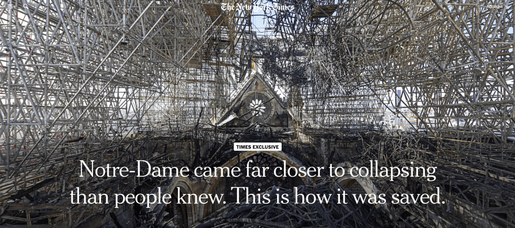
When Notre Dame burned and nearly collapsed in April of 2019, the unimaginable loss of such a historic and iconic piece of architecture was felt throughout the world, leaving people to wonder how this tragedy could have possibly happened. In July of that same year, the New York Times posted an interactive journalism piece that broke down the events that left Notre Dame in shambles.
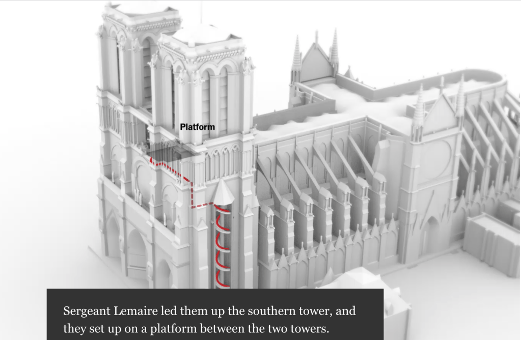
What I like about this news interactive is that it creates a timeline for the reader of exactly what happened when, pairing the live visual with text so the reader can both read and see the errors made that could have been avoided to try and salvage the church. Thanks to interactive journalism pieces such as this, the reader no longer has to paint an image in their head of what the story they are being told looks like, journalists are giving very clear and direct visuals of what happened and showing you how, providing the most information in the most effective way possible.

What I like about this news interactive is that it creates a timeline for the reader of exactly what happened when, pairing the live visuals with text so the reader can both read and see the errors made that could have been avoided to try and salvage the church. Thanks to interactive journalism pieces such as this, the reader no longer has to paint an image in their head of what the story they are being told looks like, journalists are giving very clear and direct visuals of what happened and showing you how, providing the most information in the most effective way possible.
